
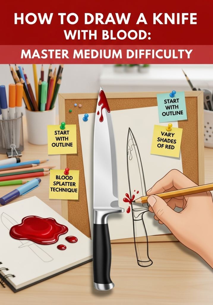
This intermediate illustration project is perfect for artists who have mastered basic form shading and want to level up their skills in realistic texture rendering, dramatic contrast, and natural fluid dynamics. Unlike beginner knife tutorials that rely on simple silhouettes, this guide walks you through capturing metallic sheen, organic blood flow, and gritty, lifelike detail for a polished, professional finished piece, following observational drawing best practices from the National Gallery of Art's drawing fundamentals guide. No prior experience with horror or graphic illustration is required—just basic pencil control and foundational shading skills. By the end of this tutorial, you’ll have a striking, realistic drawing that looks like it could lift right off the page.
Materials & Tools for Realistic Results
The right supplies make a massive difference in the realism of your final piece, especially when working with reflective metal and translucent fluid effects. You don’t need expensive professional tools to get great results—most of these items are available at any standard art supply store.
Core Drawing Supplies
Start with these essentials to get clean, precise lines and smooth shading:
- 2H pencil for light, erasable guideline marks (it won’t indent your paper like harder leads)
- A set of graphite pencils ranging from 2B to 8B for building deep, rich shadows and smooth gradients
- Kneaded eraser to lift highlights off the shiny blade surface without damaging your paper
- Vinyl eraser for crisp cleanup of final line work
- Blending stump (tortillon) for smooth, seamless blood shading
- 12-inch ruler to keep blade edges straight and proportional
- 0.3mm mechanical pencil for micro-details like tiny blade scratches or blood droplet edges
- Pencil sharpener to keep fine points for detailed work
Paper Selection
Paper choice is critical for this project: opt for 140lb (300gsm) smooth bristol board, which is thick enough to handle heavy erasing and blending without tearing, and has a smooth surface that makes metallic highlights pop. Avoid textured watercolor paper here, as its rough surface will make the blade look dull instead of shiny. Acid-free paper is also recommended, as it will resist yellowing over time so your finished piece stays vibrant for years, just like a durable wooden cutting board resists wear from daily use.
Optional Color Supplies
If you want to add color to the blood for a more vivid effect, pick up these optional items:
- Water-soluble red colored pencils for soft, blendable, translucent blood tones
- Alcohol markers for saturated, wet-looking blood that dries quickly
- White gel pen for tiny, sharp highlights on wet blood droplets to sell the wet effect
 All materials needed for this project are affordable and widely available at art supply stores.
Credit: www.amazon.com
All materials needed for this project are affordable and widely available at art supply stores.
Credit: www.amazon.com
Master Knife Anatomy for Accurate Proportions
Even small proportion errors will make your knife look unrealistic or toy-like, so it’s worth spending 5 minutes studying a real kitchen knife (a standard drop-point model works best for this tutorial) before you start sketching. Familiarizing yourself with key knife parts will help you capture both its functional form and its visual character.
Blade Key Features
The blade is the most recognizable part of the knife, and its taper is the most common proportion mistake new artists make. Key features to note:
- Spine: The thick, unsharpened top edge of the blade, usually 1/8 to 1/4 the total width of the blade
- Bevel: The angled, flat section between the spine and the edge, which is where the bright metallic highlight will sit in your drawing
- Edge: The thin, sharp cutting side of the blade, which appears as a hair-thin line in reference photos
- Point: The tip of the blade; we’re using a standard drop point for this tutorial, where the spine slopes gently down to meet the edge at the tip, for a balanced, realistic look
The blade should taper smoothly from the handle to the point: the spine will slope downward gradually, while the edge stays almost straight with only a very slight curve. The blade should be roughly 1.5 times longer than the handle, which matches standard kitchen knife proportions.
Handle Structure
The handle is often the most overlooked part of a knife drawing, but it adds critical context for how the knife would be used. Key features to include:
- Tang: The section of the blade that extends into the handle, usually hidden but visible as small pin holes where it’s attached to the handle scales
- Scales: The two side plates of the handle, made of wood, plastic, or metal, which determine the handle’s texture
- Bolster: The thick metal band between the blade and handle, which adds weight and creates a clear visual break between the two sections
The handle should have a slight outward curve to fit a human grip, and small texture details (wood grain, stitching on a leather wrap, ridges on a plastic handle) will make it feel tangible to viewers.
 Labeled sketch of a standard drop-point kitchen knife, the reference model for this tutorial.
Credit: www.mathiesonart.co.uk
Labeled sketch of a standard drop-point kitchen knife, the reference model for this tutorial.
Credit: www.mathiesonart.co.uk
Step-by-Step Outline Sketching (No Pressure, Light Lines First)
Your initial outline sets the foundation for the entire piece, so take your time with this step to avoid proportion errors later. All guideline lines should be drawn very lightly with your 2H pencil so they’re easy to erase.
Step 1: Map Your Composition
The placement and angle of your knife will completely change the mood of your drawing. A knife angled diagonally from the bottom left to top right of the page feels dynamic and tense, while a centered horizontal knife feels static and display-like. For this tutorial, we’ll use a 30-degree diagonal angle with the blade pointing to the top right to create movement. Leave a 1-inch margin on all sides of your paper so you can add blood drips that extend off the edge later, a small detail that adds major realism.
Step 2: Block In Basic Shapes
Use your ruler to draw very light, simple shapes to map proportions:
- A long thin rectangle for the blade (4 inches long, 1 inch wide for a standard 9×12 inch paper)
- A shorter rectangle for the handle (2.5 inches long, 0.75 inches wide)
- A small circle for the bolster between the blade and handle
Don’t worry about curves or details yet—just focus on getting the relative sizes correct. The blade should be roughly 1.5 times longer than the handle, as noted in the anatomy section.
Step 3: Refine the Outline
Once your basic shapes are proportional, go over the lines with a 2B pencil to add the blade’s taper (sloping spine, mostly straight edge) and the handle’s slight grip curve. Keep your lines light—you’ll erase most of these later when you add shading. A common mistake here is making the blade too thick or the handle too short, which makes the knife look like a toy. If you’re unsure, hold a real knife up to your sketch to check proportions.
Step 4: Add Guideline Marks for Shading
Draw a very light line down the center of the blade’s bevel to mark where your primary highlight will go. Add small, faint curved lines along the edge and point of the blade to mark where blood will pool and drip, so you don’t have to guess placement later.
Add Texture and Realistic Detail to Knife Surfaces
This is the step that separates a basic sketch from a realistic, tangible drawing. Focus on how light interacts with different surfaces to create depth.
Blade Metallic Texture
Metal reflects light in sharp, defined highlights, not soft gradients like fabric or skin. To get a realistic metallic sheen:
- Shade the entire blade with a 2B pencil, leaving the center bevel line you drew earlier completely white (this is your primary highlight)
- Use a 4B pencil to add soft, subtle shadows along the spine and edge of the blade, where light can’t reach
- Add tiny, faint scratches across the blade with a sharp 2H pencil to show wear and make the metal look used, not brand new
- Use a ruler to keep your highlight edges crisp—precision here is just as important as when you’re cutting foam core for display projects
A common mistake is shading the entire blade evenly, which makes it look like a flat grey block instead of shiny metal. The contrast between the bright highlight and dark shadows is what sells the metallic effect.
Handle Texture
Adjust your shading and line work to match the handle’s material:
- For a wooden handle: sketch thin, wavy lines to represent the grain, just like the distinct wood pattern you’d see on a handmade butcher block board. Shade lightly with a 2B pencil to show the wood’s natural warm tone, and add tiny darker spots for knots or wear.
- For a plastic or metal handle: use smooth, even shading with no texture, and add tiny, sharp highlights where light hits any ridges or grooves.
- If your handle has a lanyard hole, add a small dark circle for it, with a tiny white highlight on one edge to show it’s a hole, not a solid dot.
Edge Definition
The edge is the knife’s defining feature, and it needs to look sharp and lethal. Use a sharp 2B pencil to draw a clean, dark line for the edge, darker than the rest of the blade to show its thinness. Add a tiny white highlight right along the edge if your light source is hitting it directly—this is the "glint" that makes the knife feel sharp enough to cut, mirroring the crisp edge of a well-maintained cutting board edge.
Create Realistic, Natural Blood Effects
Blood is a thick, viscous fluid, so it doesn’t behave like water—it drips slowly, pools in low spots, and leaves smudges if wiped. Getting these small details right will make your blood effect look lifelike instead of cartoonish.
Understand Blood Physics for Accurate Placement
Before you draw a single drop of blood, decide on the knife’s "backstory" to inform placement:
- If the knife was freshly used: place blood along the cutting edge, dripping from the lowest point of the blade (usually the tip), and small smudges on the handle where a hand would have gripped it.
- If the knife has been wiped clean: draw faint streaks of blood along the blade, small smudges on the handle, and no dripping.
Gravity is your guide: blood will always flow downward, so never place drips or pools in spots that would be higher than the blade’s lowest point. A common mistake is scattering blood randomly across the blade, which looks unnatural and breaks the illusion of realism.
Shade Blood for Depth and Wetness
Blood is not flat red—it has highlights where light hits the wet surface, dark shadows where it pools, and a slightly translucent quality where it’s thin. To shade it realistically:
- Lay down a base layer of dark red (for color) or dark grey (for graphite) where the blood is thickest: the pool at the bottom of the drips, and the thickest smudges on the blade.
- Add a lighter red/grey highlight on the top edge of the drips and pool, where light hits the wet surface.
- For thin smears, use a light touch with your pencil to make the blood look translucent, so you can see a faint outline of the blade underneath.
- For graphite drawings, leave a tiny white highlight on the edge of each drip to make it look wet.
Add Splatter and Drip Details
For extra realism, add tiny, random blood spatter around the knife (not just on it) to show it was recently used. Use a toothpick to flick tiny dots of ink or colored pencil for spatter, or draw tiny individual droplets with a fine-tip pen. Add 1-2 long drips coming off the lowest point of the blade, with a small round droplet at the end of each drip, to show the blood is still wet. Remember: less is more. Too much blood looks cartoonish, not realistic—stick to 3-5 drips maximum for a natural effect.
Refine and Finalize Your Drawing
The final steps are all about polishing your work to make it look professional and cohesive.
Step 1: Clean Up Your Lines
Use your vinyl eraser to gently erase all the light guideline lines you drew for the outline and proportions, being careful not to smudge the shading you’ve already added. Use your fine-tip mechanical pencil to darken any lines that got erased too much, like the edge of the blade and the outline of the blood.
Step 2: Adjust Contrast and Depth
Step back 3-4 feet from your drawing—this distance helps you see if the blade looks shiny enough and the blood has enough depth, just like you’d step back to assess a finished charcuterie board for visual balance. If the blade looks flat, add darker shadows along the spine and under the bolster with a 6B pencil. If the blood looks flat, add a darker red/grey layer to the deepest parts of the pool, and a tiny white highlight to the top of each drip. A common mistake is overworking the shading, which makes the drawing look muddy. If you’re unsure, stop adding shading and let wet media dry completely before making more changes.
Step 3: Final Review Checklist
Run through this quick checklist before you call your drawing done:
- Are the knife proportions accurate (blade 1.5x longer than handle, spine slopes smoothly to the point)?
- Does the blade have a clear, bright highlight to show it’s metallic?
- Is the blood placed according to gravity, with drips coming only from the lowest point of the blade?
- Are there no stray guideline lines left?
- Does the contrast between the dark blood, deep shadows, and bright blade highlight make the drawing pop?
If you check all these boxes, your medium-difficulty knife with blood drawing is complete.
Frequently Asked Questions
Do I need to use color for the blood, or is graphite enough?
Graphite works perfectly for realistic blood if you prefer a monochrome piece. Use 4B to 6B pencils for dark, rich blood tones, and leave tiny white highlights for wetness. Color is optional, but if you want a more vivid effect, water-soluble red colored pencils blend smoothly for a wet, translucent look.
How do I fix smudged blood or blade highlights?
Use a kneaded eraser to gently lift smudged graphite or colored pencil off the blade’s highlight area. For colored media, wait for the layer to dry completely before erasing, or use a colorless blender pen to soften smudges instead of erasing.
What's the best angle to draw the knife for a dramatic effect?
A 30 to 45-degree diagonal angle (blade pointing toward the top right or top left of the page) creates the most tension and movement. Avoid centering the knife horizontally, as it will look static and less engaging.
Can I use a reference photo for this drawing?
Absolutely—using a reference photo of a real knife (with or without blood) is highly recommended for accuracy, especially for blade proportions and blood flow. Just avoid tracing directly, as that will limit your skill growth.
How long does this project take to complete?
For intermediate artists, expect to spend 2 to 4 hours on the full piece, including sketching, detailing, and refining. Beginners may need an extra hour or two to adjust proportions and practice blood shading.
Conclusion
Completing a realistic drawing of a knife with blood is a rewarding milestone for intermediate artists, building transferable skills in metallic texture rendering, fluid dynamics, and dramatic contrast that will improve every piece you create going forward. If you run into proportion errors or blood that looks unnatural, don’t get discouraged—these are common, fixable issues that every artist faces when learning new techniques. The best way to improve is to practice the outline and blood placement steps separately a few times before starting a full finished piece. Once you’ve mastered this project, challenge yourself by drawing other reflective objects (glass jars, metal utensils) or adding liquid effects to different subjects to hone your skills further. Ready for your next intermediate art challenge? Explore our full library of step-by-step drawing and creative guides on our blog to keep building your portfolio.

Hi, I’m Daniel Brooks—a food lover and kitchen gear enthusiast. I enjoy testing cookware, utensils, and gadgets to see what really works in everyday cooking. At PlugChef.com, I share honest reviews, comparisons, and simple guides to help you choose the best tools for a safer, smarter, and more enjoyable kitchen.
Related posts:
 How to Make a Fruit Basket for a Gift: Easy DIY Guide
 Basket Capacity And Usage Tips: Maximize Your Air Fryer Efficiency
 How to Use Silicone Basket in Air Fryer: Expert Tips
 Farmhouse Kitchen With White Appliances: Timeless Elegance
 Are Ninja Blenders Dishwasher Safe: Discover the Truth
 High End Kitchen Appliance Brands: Elevate Your Culinary Space

