
If you’re coordinating a canned food drive for your school, local food bank, or community group, you’ve likely already sorted drop-off locations, lined up volunteers, and set a donation goal. But if your last campaign fell short of its target, the missing piece may not be your outreach efforts—it’s your poster design. Canned food drive posters are your most low-cost, high-impact outreach tool, especially for reaching local residents who don’t follow your organization’s social media or email lists. In 2026, with digital noise crowding every feed, a well-designed, strategically placed physical poster cuts through the clutter to turn passive viewers into active donors. As of 2024, the USDA reports that 1 in 9 U.S. households face food insecurity, meaning millions of families rely on food bank donations to put meals on the table. This guide breaks down evidence-based design and messaging strategies to create posters that don’t just get looked at, but drive measurable increases in donations for your cause.
Why Canned Food Drives (And Their Posters) Matter More Than Ever
The Critical Role of Canned Goods in Fighting Hunger
Canned goods are the backbone of most food bank inventories, and for good reason: their 1–5 year shelf life eliminates risk of spoilage, they require no refrigeration for storage, and they provide shelf-stable, nutrient-dense options like proteins, vegetables, and fruits that are easy for families to prepare. Unlike perishable donations, canned goods can be stockpiled during high-demand periods like holidays or summer break, when child nutrition programs are on pause and food demand spikes. Every can donated goes directly to a local family’s meal, with no waste from expired goods.
The Unique Power of Physical Posters for Local Outreach
While digital outreach reaches people who already follow your organization, physical posters remain one of the most trusted sources of information for hyperlocal community events, as they feel official and community-focused rather than algorithm-driven. They reach passersby who may have never heard of your drive before: seniors, families without regular social media use, people running errands in the neighborhood, and visitors to local businesses. A well-placed poster in a grocery store or library can reach hundreds of potential donors in a single day with no ongoing cost beyond the initial print run. Food banks rely on stackable dry storage to keep donated non-perishables organized and pest-free between distributions, making your canned donations even more impactful for long-term community support.
Core Design Elements for Posters That Grab Attention and Drive Action
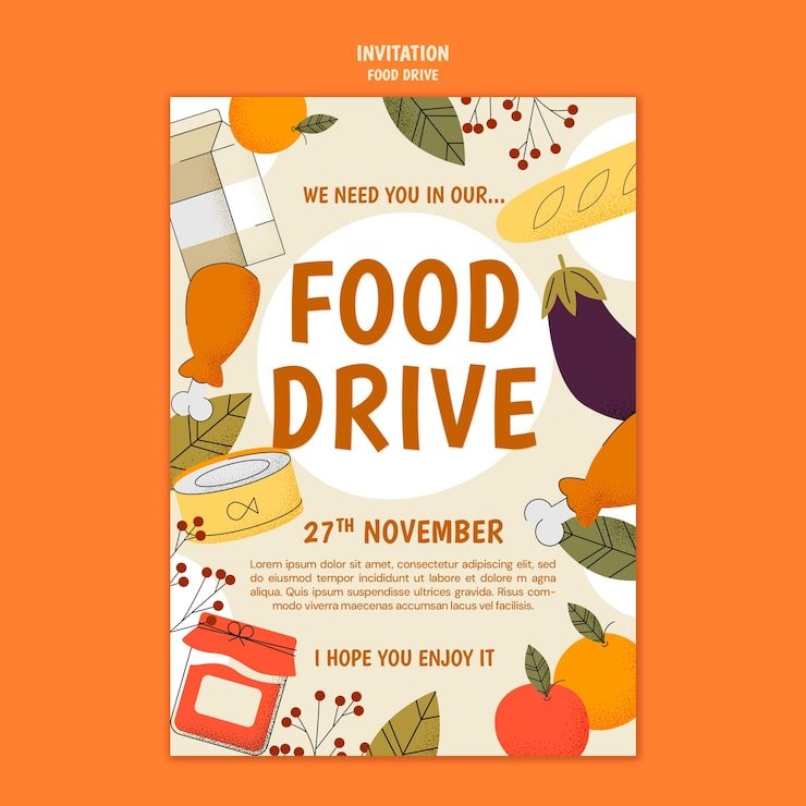
 Sample zero-hunger poster template with bold, accessible design elements for community food drives
Color Palettes That Build Trust and Prompt Action
Color psychology directly impacts whether people stop to look at your poster or walk past it. Warm, muted tones like burnt orange, soft red, and forest green evoke care, gentle urgency, and nourishment without feeling alarmist or salesy, which is critical for a community-focused cause. High contrast between text and background is non-negotiable: dark navy or black text on a white or cream background, or white text on a dark green or navy background, ensures readability from 10 feet away, even for people with visual impairments. Limit your palette to 3 core colors max to avoid visual clutter. A common mistake is using bright neon colors that feel like a retail sale flyer, which can make people dismiss your poster as spam rather than a community call to action.
Typography Optimized for Quick, At-A-Glance Reading
Per CDC accessibility guidelines for public-facing materials, sans-serif fonts like Open Sans, Lato, or Montserrat are the gold standard for quick readability, especially for audiences with visual impairments or limited English proficiency. Use bold weight exclusively for the 3 most critical pieces of information: what to donate, drop-off location/deadline, and your call to action. Headlines should be at least 3 inches tall when printed to be visible from across a room, and avoid all-caps for long blocks of text, as it reduces readability for most viewers. Skip script or decorative fonts entirely for body text, as they slow reading speed and make your message inaccessible to many community members.
Imagery That Feels Authentic, Not Generic
The most effective imagery for food drive posters is either authentic, local photos (candid shots of past volunteers, local students, or community members dropping off donations) or simple, bold icons of canned goods, food boxes, or hands giving. Generic stock photos of smiling strangers holding cans often feel inauthentic, and viewers will tune them out as irrelevant to their local community. If you use photos, feature people your audience will recognize to build trust. Leave at least 30% of the poster as white space to avoid clutter and make key information pop. Avoid low-resolution or busy graphics that distract from your core message.
Crafting a Message That Motivates Immediate Action
A Clear, Specific Call to Action (No Vague Requests)
Your call to action (CTA) should be a single, specific action, not a vague plea. Instead of “Support our food drive”, use “Drop off canned goods at 123 Main St by Dec 20” or “Text DONATE to 555-1234 to schedule a free pickup for large donations”. Place the CTA in the bottom third of the poster, where viewers’ eyes naturally land after scanning the top, and make it 2x larger than any other text on the design. If you have a specific donation goal (e.g., “We need 500 cans to stock our local food bank for the holidays”), include it directly next to the CTA to create a sense of collective purpose. Vague language like “help if you can” creates decision fatigue and reduces the likelihood people will take action.
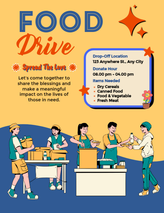 Example of a high-performing food drive flyer with scannable key information and a clear call to action
Using Impact Stats and Social Proof to Build Credibility
People are more likely to donate when they understand the tangible impact of their contribution. Use local, relevant data if possible: “Last year, our drive provided 2,000 meals to families in [Your Town], and we need your help to beat that number this year.” If you don’t have local data, cite trusted national sources like the USDA, which notes that canned goods make up roughly 60% of total food bank inventory due to their long shelf life and ease of distribution. Stick to one or two key stats that tie directly to the impact of a single donation, e.g., “One can of beans provides 2 meals for a local family.” You can also add a short, permissioned testimonial from a past donor or food bank recipient to build trust: “Last year’s drive helped my family get through a tough month after I lost my job—thank you, community.” Avoid overloading the poster with too many numbers, as this will overwhelm viewers.
Print vs. Digital Posters: How to Use Both to Maximize Reach
Optimizing Print Posters for Local High-Traffic Spots
For physical posters, use 80lb matte cardstock instead of regular printer paper to resist humidity, rain, and handling in grocery stores or community centers. Laminate posters if placing them outdoors or in high-moisture areas like near coffee shop entrances. For placement, prioritize eye-level spots (5–6 feet high) in high-foot-traffic areas: grocery store entrance and exit doors, library bulletin boards, school cafeterias, church lobbies, and community center front desks. Always ask permission from business or property managers before posting, and offer to take the poster down after the drive ends to maintain good relationships. If your community has multilingual populations, include key information (date, location, CTA) in the 2 most common non-English languages spoken locally to expand your reach. Add a QR code linking to your full wish list, volunteer sign-up page, or food bank website for viewers who want more details or prefer to donate online. Volunteers often use sorting bins for donations to categorize canned goods by type as they arrive to streamline distribution.
Digital Posters for Online and Social Media Outreach
Digital posters are optimized for sharing on local community Facebook groups, Nextdoor, Instagram, and your organization’s website. Design them in square (1:1) or vertical (9:16) formats, as these perform best on mobile feeds. Add text overlays for key information so people can read details even without clicking through to your caption. Tag local businesses, community groups, and local news outlets when you share to expand your reach. Post reminders 1 week before the drive, 3 days before, and the day of to catch people at different points in their planning. You can also create a shareable graphic version of the poster with a pre-written caption, so supporters can easily share it to their own feeds. For pop-up drives at farmers markets or community events, portable lidded storage keeps donations safe from the elements until they can be transported to the food bank. Large donations from grocery stores or restaurant suppliers often require large-capacity food storage to transport and store safely before distribution. Many donors bring a few cans from home, so having small donation-ready containers available at drop-off locations makes the process smoother for everyone.
 Customizable modern food drive flyer template with space for a QR code linking to your donation wish list
Common Poster Mistakes That Drastically Reduce Donations
Overloading the Poster With Too Much Information
The #1 mistake drive organizers make is cramming every possible detail onto the poster: full mission statements, volunteer sign-up links, lists of 20+ accepted items, and long paragraphs of text. This overwhelms viewers, who will tune out instead of parsing the information. Stick to 3–4 core pieces of information maximum: what to donate, drop-off location/deadline, and your CTA. Put all other details on a smaller handout or your website, and link to it via a QR code on the poster.
Using Hard-to-Read Fonts or Low-Contrast Colors
Small font sizes, script fonts, or light text on light backgrounds make posters unreadable from even a few feet away, especially for older adults or people with visual impairments. Always test your design by printing a test copy and viewing it from 10 feet away—if you can’t read the CTA clearly, it’s too small or low-contrast.
Forgetting Clear, Specific Next Steps
Even the most beautiful poster will fail if people don’t know how to act. Don’t assume people know where your drop-off location is—include the full address, and if it’s inside a larger building (like a grocery store or school), specify exactly where to drop the goods (e.g., “Drop off at the customer service desk, next to the checkout lanes”). If you offer pickup for large donations, include the phone number or link to schedule a pickup directly on the poster.
Frequently Asked Questions
What makes an effective canned food drive poster?
Effective posters prioritize readability and clear action above all else. They use high-contrast color palettes, large sans-serif fonts, and authentic local imagery to grab attention from a distance. The 3 most critical pieces of information—what to donate, where to drop it off, and the deadline—are front and center, with a single, specific call to action that tells viewers exactly how to help. Posters with clear, specific CTAs consistently see far higher engagement than those with vague requests like “support our cause”.
How do I design a catchy canned food drive poster on a tight budget?
You don’t need a professional graphic designer to create an effective poster. Free tools like Canva have pre-made food drive poster templates you can customize with your own photos, text, and branding. Use free, high-quality stock photos from sites like Unsplash that feature local community members, or take candid photos of past drives to use for free. Print posters at a local print shop for as little as $1–$2 each for 11×17 cardstock, or print them at home if you only need a small number.
Where should I distribute my canned food drive posters?
Prioritize high-foot-traffic, permission-approved locations where your target audience already shops, works, or gathers: grocery store entrance and exit doors, library bulletin boards, school cafeterias, church lobbies, community center front desks, local coffee shops, and public transit stops. For digital posters, share them in local community Facebook groups, Nextdoor, and your organization’s social media pages. If your community has a large multilingual population, translate the key information (date, location, CTA) into the 2 most common non-English languages spoken locally.
What information should I include on my canned food drive poster?
Stick to 3–4 core pieces of information maximum to avoid overwhelming viewers: 1) the donation deadline, 2) the drop-off location (with specific instructions if needed, e.g., “at the customer service desk”), 3) a list of the most needed items (e.g., “canned proteins, peanut butter, and baby food most needed”), and 4) a clear CTA. Include a QR code linking to your full wish list, volunteer sign-up page, or food bank website for viewers who want more details. Skip long paragraphs of text—keep all copy short and scannable.
How many posters do I need for a small community food drive?
For a drive serving a neighborhood of 5,000–10,000 residents, plan to print 20–30 11×17 posters for high-traffic local spots, plus 50–100 smaller half-page flyers for community boards and local businesses. If you’re hosting a pop-up drop-off event, add 10–15 larger 18×24 posters for the event location itself. Distribute posters 1–2 weeks before the drive starts, and replace any that get damaged or taken down during the campaign.
Conclusion
Canned food drive posters are far more than just a way to share event details—they’re a low-cost, high-impact tool to mobilize your community and boost donation totals for local families facing food insecurity. By focusing on clear, accessible design, authentic local messaging, and strategic placement, you can turn a standard flyer into a driver of real, measurable change. Before you print, test your design by viewing it from 10 feet away and asking a colleague or community member if they can understand your core message and CTA in 3 seconds or less—if they can’t, tweak the design until they can. For more tips on planning successful community events and organizing donated goods, check out our full library of community outreach tips.

I’m Abby Lu, a passionate home cook who loves simplifying everyday meals. At PlugChef.com, I share product reviews and cooking guides to help you find the best tools for your kitchen.
Related posts:
 How Does a Certified Organic Kitchen Clean Dishware Efficiently?
 Preventing Sticking And Grease Buildup: Expert Tips & Tricks
How to Detach Air Fryer Basket: Easy Step-by-Step Guide
Preventing Sticking And Grease Buildup: Expert Tips & Tricks
How to Detach Air Fryer Basket: Easy Step-by-Step Guide
 Slate Kitchen Appliances With White Cabinets: Style Upgrade
 Small Electrical Appliances: Maximize Your Home Efficiency
 Blue Kitchen Cabinets With Stainless Steel Appliances: Modern Elegance

