
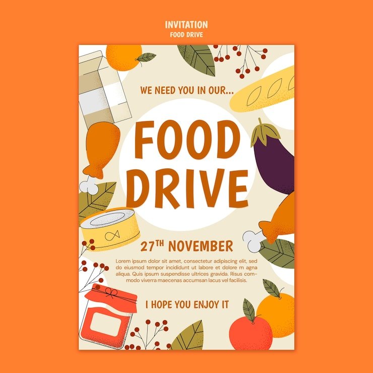
Are you looking for a simple way to make a big difference in your community? Posters for food drives can be your secret weapon.
They grab attention, spread your message quickly, and inspire people to take action. Whether you’re organizing a local event or helping a larger campaign, the right poster can turn strangers into supporters. Keep reading to discover how to create posters that not only look great but also motivate people to donate and help those in need.
Your food drive deserves to be noticed—let’s make sure it is.

Credit: www.freepik.com
Choosing Bold Colors
Choosing bold colors for food drive posters makes a strong impact. Bright hues grab attention and convey urgency. They help your message stand out amidst the clutter. Using bold colors can inspire people to act and support your cause.
Colors That Attract Attention
Red is a powerful color that draws eyes immediately. It signifies urgency and importance. Yellow is cheerful and optimistic, perfect for conveying hope. Orange combines the energy of red and joyfulness of yellow. These colors can evoke excitement and motivate contributions. Blue is calming and reliable, creating trust. Green links to nature and growth, suggesting positive change.
Color Psychology In Fundraising
Colors influence emotions and decisions. Red creates a sense of urgency, encouraging quick action. Yellow brings warmth and happiness, inspiring generosity. Blue builds trust, making people feel secure in their donations. Green symbolizes renewal, appealing to those who care about sustainability. Orange can spark enthusiasm, driving community involvement. Choosing the right colors impacts the success of your food drive.
Using Compelling Images
Using compelling images in your food drive posters can make a huge difference in catching attention and motivating people to act. Images communicate emotions and messages faster than words alone. Choosing the right visuals helps your poster stand out and connects with your audience on a deeper level.
Photos That Tell A Story
Photos that show real moments create a strong emotional pull. A picture of a child receiving food or volunteers working together tells a story that words cannot fully express.
Think about images that capture hope, community, or gratitude. These photos encourage empathy and inspire people to contribute. Have you noticed how a single powerful photo can make you pause and think about the cause?
Use high-quality, authentic photos rather than staged or generic ones. Authenticity builds trust and makes your message more relatable.
Icons And Illustrations For Impact
Icons and illustrations add clarity and visual interest to your poster. Simple graphics like food items, hearts, or hands can emphasize your message without overwhelming the viewer.
They are especially useful when you want to highlight key points or steps, such as what types of food to donate. Clear icons make information easier to digest at a glance.
Combining illustrations with photos can balance emotion with information. Are your icons bold and straightforward enough to catch the eye?
Crafting Clear Messages
Clear messages are key to effective food drive posters. They grab attention fast. They help people understand the cause quickly. Simple, direct words make the message strong. The goal is to inspire action without confusion.
Focus on clarity and impact. Avoid clutter and long sentences. Use language that anyone can understand. This way, the poster reaches more people and motivates them to help.
Short And Powerful Text
Keep text brief and focused. Use short sentences or phrases. Highlight the food drive’s purpose in a few words. Examples like “Help Feed Families” or “Donate Today” work well.
Use bold fonts for important words. Make key points easy to read at a glance. Avoid detailed explanations on the poster. Save those for other materials.
Call To Action Tips
Make the call to action clear and direct. Use commands like “Donate Now” or “Bring Canned Food Here.” Place the call to action where it stands out.
- Use contrasting colors to highlight the call.
- Include simple instructions or location details.
- Repeat the call to action if space allows.
These tips guide people on how to help immediately. Clear calls increase participation in the food drive.
Incorporating Branding Elements
Adding your brand elements to posters for a food drive makes a strong impression. It helps people recognize who is organizing the event and builds trust. When you use your branding clearly, your message stands out and invites more support.
Logo Placement
Your logo should be visible but not overpower the main message. Placing it at the top corners or near the event title works well. This keeps your brand present without distracting from important details like date and location.
Think about where people’s eyes naturally go when they first see a poster. Position your logo there to catch attention quickly. Have you noticed how some posters feel cluttered? Proper logo placement avoids that problem and keeps the design clean.
Consistent Fonts And Styles
Using the same fonts and styles as your other materials makes your poster look professional. Choose fonts that are easy to read from a distance to grab attention fast. Keep font sizes balanced—headings larger, details smaller but clear.
Colors also play a big role. Stick to your brand’s color palette to create a cohesive look. This consistency helps people instantly associate the poster with your organization. Have you ever seen a poster that felt off? Often, inconsistent fonts and colors cause that.
Design Layout Strategies
Design layout strategies play a crucial role in making posters for food drives effective. A well-planned layout grabs attention and clearly shares the message. It helps viewers understand the purpose quickly and encourages action. Good design balances visual elements and text to create a clean and inviting look. This section explores key ways to arrange your poster content for the best results.
Balancing Text And Images
A poster should have a clear focus. Too much text can overwhelm the viewer. Too many images can distract from the message. Balance is key.
- Use bold headlines to capture attention fast.
- Keep body text short and simple.
- Choose images that support the message.
- Place images near related text for easy reading.
This balance helps guide the viewer’s eyes through the poster. It creates a smooth flow from one point to the next. Clear text and strong visuals work together to inspire donations.
Using White Space Effectively
White space is the empty area around text and images. It prevents clutter and makes content easier to read. White space helps important parts of the poster stand out.
- Leave margins around the edges for a neat look.
- Space out text blocks to avoid crowding.
- Separate images with enough space for clarity.
- Use white space to highlight key information.
Effective use of white space gives the poster a clean feel. It invites viewers to focus on the message without feeling overwhelmed. White space makes your food drive poster welcoming and easy to understand.

Credit: www.freepik.com
Printing And Material Choices
Choosing the right printing and material options for your food drive posters can make a big difference in how your message is received. The durability and look of your posters influence whether people notice and remember your cause. Think about where your posters will be displayed and how long they need to last to help guide your choices.
Paper Types For Durability
Paper choice affects how long your poster stays intact, especially outdoors or in busy areas. Glossy paper feels smooth and resists moisture better, making it a solid pick if your posters face weather exposure.
Matte paper cuts down on glare, so your message stays clear under bright lights. For extra toughness, consider cardstock or synthetic papers—they won’t tear easily and can handle rough conditions.
Ask yourself: Will your poster need to survive rain or wind? Selecting a sturdier paper upfront saves you from reprinting costs and keeps your food drive visible longer.
Finishes That Enhance Visual Appeal
Finishes add that final touch, making your posters pop and draw attention. A UV coating not only shines but also protects against fading, which is great if your posters catch a lot of sunlight.
Lamination offers strong protection and a sleek look, helping your poster resist smudges and spills. If you want a softer, more natural feel, a matte finish reduces glare and keeps colors vibrant without the shine.
Think about your audience—would a bright, eye-catching finish motivate them to stop and read, or would a subtle look fit better with your community’s vibe? Your finish choice can influence how people connect with your message.
Digital Posters For Online Campaigns
Digital posters play a vital role in online food drive campaigns. They spread awareness quickly and reach a broad audience. These posters can be shared across multiple platforms, gaining attention for the cause. Well-designed digital posters increase engagement and inspire action. They use strong visuals and clear messages to connect with people.
Optimizing For Social Media
Social media platforms have different size requirements for images. Optimizing posters to fit these sizes ensures they look good everywhere. Use clear, bold text that is easy to read on small screens. Bright colors and simple designs grab attention faster. Include a call-to-action that tells viewers what to do next. Make sure the file size is small for quick loading. Use keywords in the poster description to improve search visibility.
Interactive Poster Elements
Interactive posters invite users to engage directly with the content. Add clickable buttons to link to donation pages or event sign-ups. Use QR codes that people can scan with their phones. Include short videos or animations to explain the food drive’s impact. Polls or quizzes can make the experience fun and informative. Interactive elements encourage sharing and increase participation in the campaign.
Examples Of Successful Posters
Successful posters for food drives grab attention quickly and inspire action. They communicate the cause clearly and make it easy for people to understand how they can help. Looking at examples from past campaigns can give you practical ideas for your own designs.
Case Studies From Past Food Drives
One food drive poster used bold, bright colors with a simple call to action: “Donate Now. Feed Families.” This direct message made it clear what was needed and why. The organizers paired it with images of smiling families, which created an emotional connection.
Another campaign featured a poster with a countdown timer graphic showing how many days were left to donate. This created urgency and boosted participation. The design also included a QR code, making it easy for people to give immediately through their phones.
A local community center designed posters with a checklist of food items needed, making the donation process straightforward. They also added a map showing drop-off locations, which helped increase turnout by removing confusion.
Lessons Learned From Top Designs
- Keep text concise:Too much information overwhelms viewers. Stick to clear, short phrases that highlight the goal.
- Use strong visuals:Images of people or food create empathy and make the cause feel real.
- Include a clear call to action:Tell people exactly what to do next—donate, drop off, volunteer.
- Make it easy to act:Adding QR codes or website links increases chances of immediate participation.
- Create urgency:Deadlines or progress bars motivate faster responses.
Have you noticed how posters that combine emotion with simplicity tend to get more attention? Think about your own community and what visuals or messages might resonate best. What small changes could make your poster stand out and drive more donations?

Credit: www.freepik.com
Frequently Asked Questions
What Makes A Food Drive Poster Effective?
An effective food drive poster has clear messages and eye-catching visuals. It highlights the event date, location, and donation needs. A strong call-to-action motivates people to participate. Using bright colors and simple fonts helps grab attention. Including contact info or a QR code boosts engagement.
How To Design Posters For Food Drives?
Design posters with bold headlines and concise information. Use relevant images like food or happy volunteers. Stick to a clean layout for easy reading. Choose colors that reflect your cause. Add event details and donation instructions clearly. Digital versions can reach more people online.
Where Should Food Drive Posters Be Displayed?
Place food drive posters in high-traffic areas like community centers, grocery stores, and libraries. Local schools, churches, and workplaces are also great spots. Visibility increases donations and volunteer sign-ups. Always get permission before posting on private property.
What Information Is Essential On Food Drive Posters?
Include the event date, time, and location prominently. List accepted food items and donation guidelines. Add a clear call-to-action like “Donate Here” or “Join Us. ” Provide contact details or a website link for questions. This ensures donors have all needed info.
Conclusion
Posters for food drives help spread the word and gather support. They catch attention and share important details clearly. Using bright colors and simple messages works best. Posters remind people to donate and join the cause. Every small effort counts to fight hunger in the community.
Creating and sharing posters can make a real difference. Start designing your poster today and help feed those in need. Together, communities grow stronger and more caring.

I’m Abby Lu, a passionate home cook who loves simplifying everyday meals. At PlugChef.com, I share product reviews and cooking guides to help you find the best tools for your kitchen.
Related posts:
 What Type of Cooking Utensils are Safe: Expert Picks
 What Innovations Could Blenders Make: Unleashing Future Tech
 Smart Strategies to Organize a Small Kitchen: Maximize Space
 How to Organize a Kitchen Cabinet: Expert Tips & Tricks
 How to Organize Kitchen Drawers: Expert Tips and Tricks
 How to Organize a Corner Kitchen Cupboard: Expert Tips

